

Simplicity and Clarity
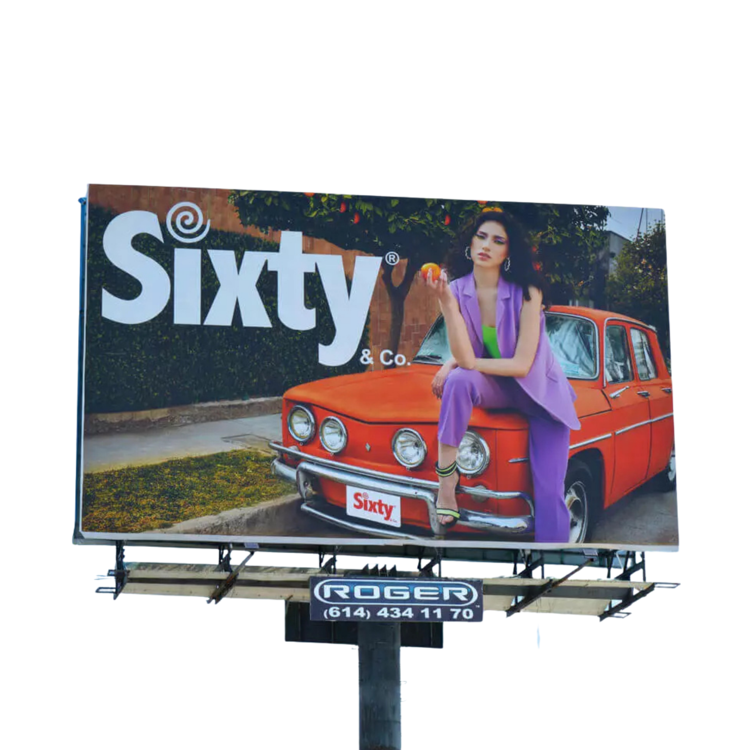
A moving message needs to be understood instantly. Eliminate everything that is not essential.
Effective Design Guide
OUTDOOR
DESIGN
Your ad competes with the visual noise of the street. These rules turn a billboard into a sales-driving tool.
6
Principles
3s
Attention
Impressions
6 OUTDOOR DESIGN RULES
RULES THAT SELL
A moving message needs to be understood instantly. Eliminate everything that is not essential.

Text must be readable from a distance using sans-serif fonts and high-contrast colors.

A memorable phrase always beats a long paragraph. Keep the text to the core of the message.

High resolution is mandatory. Pixelated images destroy your brand’s credibility at large scale.

Include a clear CTA that tells people what action they should take after seeing the ad. For example «Visit us today»

The logo and visual identity must be instantly recognizable. Do not hide them in a corner.
OUTDOOR TYPOGRAPHY
4 TYPOGRAPHIC RULES
Sans-serif fonts like Arial, Helvetica or Roboto. Simplicity over aesthetics.
Make it bigger than you think you need. It should always be readable from 30 meters away.
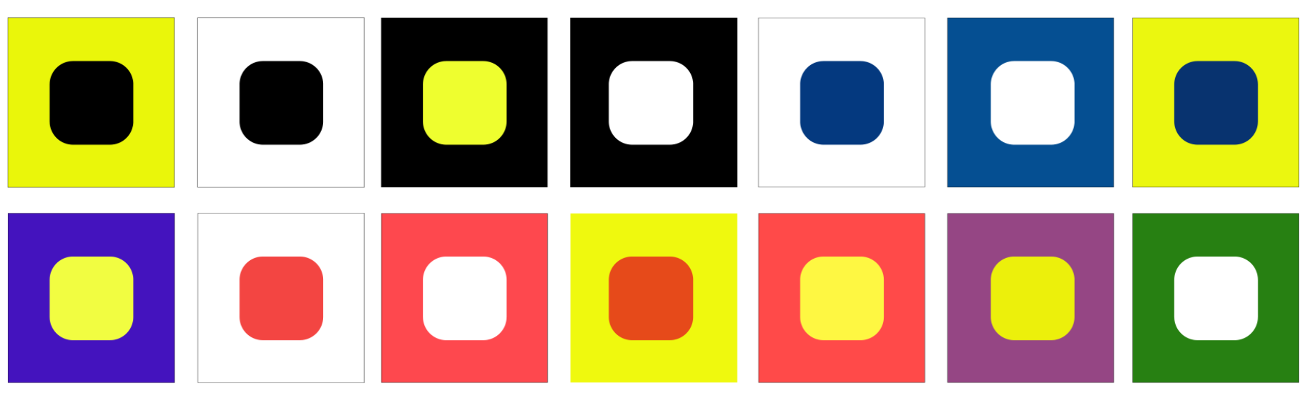
Use high-contrast colors between the text and the background to make sure the words stand out.
Uniform kerning and adequate tracking. Cramped letters are confusing from a distance.
THE POWER OF CONTRAST
CONTRAST GUIDES ATTENTION
It’s the most powerful tool in outdoor design. Using it well ensures that key elements are read instantly, at any speed and under any lighting condition.
READY TO CREATE YOUR NEXT CAMPAIGN?
Our design team works with you from concept to print.